So, I just spent an evening + morning refactoring the site into a, uh, “new” design.
I only ocassionally work on this site these days—I now see it as the sparse journal of a madman that also likes to distribute mobile-friendly versions of his CV—but I thought it would be a nice and easy blog post to reflect on how the site has changed over the last 3 years.
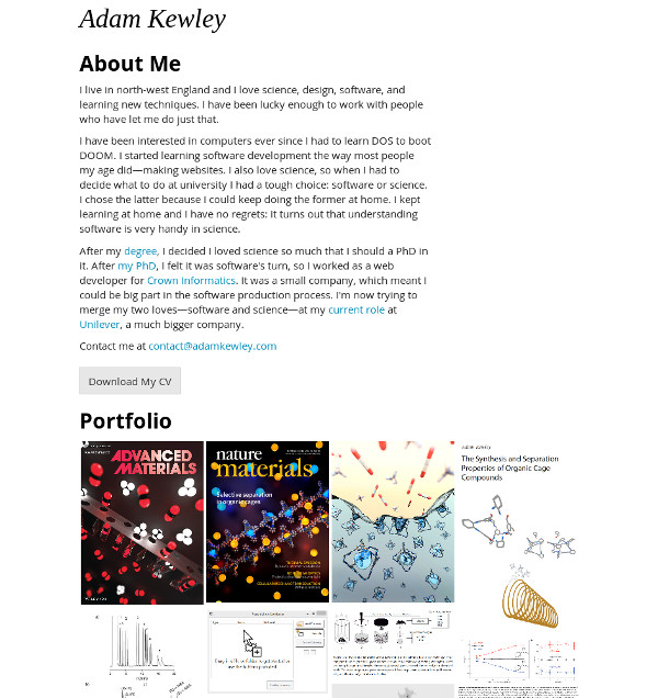
The original version of adamkewley.com was launched in May 2015 and was the fanciest design:

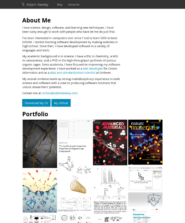
It makes me feel a bit ill. The first version was modelled off of the kind of erudite landing pages you see 3-man startups use to try and sell IoT soap bars or something. By May 2016, I clearly had gotten sick enough of my own bullshit to remove a bunch of that cute stuff:

By May 2017, there were a few regressions:

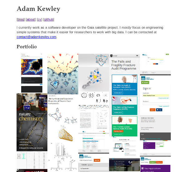
And now, in March 2018, I’ve finally decided to just throw almost all fancy tricks out the window and use the simplest HTML + CSS solution I could create:

The previous versions of this site required a bunch of javascript libraries and jekyll gems to build. There were also subtle bugs that would pop up if you used it on a phone. Development/maintenance time was dedicated to fixing that - I also couldn’t help but tweak with the code.
This new site is HTML + a ~50 line long CSS file. It felt strangely liberating to make. Maybe because after working on ReactJS (e.g.) and angular sites I came across this absolute gem that satirically makes the point that barebones sites are: a) fast, b) easy to make, and c) responsive. I couldn’t argue with the logic and immediately wanted to just rip out all the complexity in my site, so here we are.
I wonder how quickly regressions will set in ;)
